Posts

Meraki Exhibit

Image
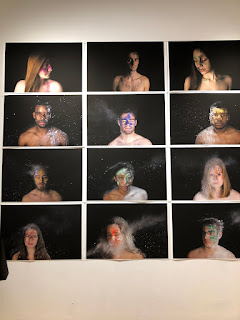
One of the art events that I attended this semester was called Meraki, and it was held on December 8th from 5-7 pm. This exhibit took place in the Art Gallery on campus, and included 8 senior artists. The assignment that they were given in the beginning of the semester was a semester long project, one that challenged them to develop their own portfolio, and often times alter their thought process about the project. One thing I found interesting, that I immediately noticed walking into this exhibit was that all of the art consisted of photos. None of the pieces focused mainly on painting or sculpture, even though a few included those elements. Each of the artists in tis exhibit spoke about their own projects and the meaning behind each. The first work that I noticed upon entering was Essence by Rachel Kingsley. It consisted of a series of photos, each including someone the artist new, and each person having different colors placed on their faces with white powder being thrown on them....
The Art of Data Visualization Video

Image
This video immediately brought about the importance between the content of a piece of art and what the viewer recognizes about the content in the piece. The speaker in the video stressed a great deal right off the bat, the importance of content in a piece of art. He described that the design and style does not matter if the content is not something that can be communicated with the viewer. The content is more important to the overall message or meaning of an art piece, than the design or composition is. The history of data visualization is brought up in this video as well. The speaker alludes back to the way Galileo documented his observations about space, in which he would draw what he saw. In turn, this became defined as data visualization, since he would produce a visual representation of what he was seeing.    I also found it interesting when the second speaker in this video brought up the way humans can communicate with others based on visualization of data. It is expla...

Postmodern Project

Image
                                                   For this project, I decided to choose the quote relating to driving. The quote reads "Driving is a spectacular form of amnesia. Everything is to be discovered, everything is to be obliterated". The main composition in this painting is my photoshopped picture surrounded by the sunset, clouds and the water. I think the rule of thirds fits well for this since the sky and the water from the photoshop picture could be lined up with the surrounding painting. When I first look at this piece, my eye immediately goes to the orange sunset, because it is a lot brighter than the other components of the painting. There is also an evident contrast in color between the blue water and the orange sky, giving the painting a complimentary color scheme feel.     The reason I chose this quote was because driving is on...

Postmodernism

I found the first reading to be quite difficult to follow, since it was very heavy on referencing the numerous cultures and practices that occur throughout each. However the one message that I received from the first article was that now in a postmodern time, the numerous cultures and their differences are meshed together to create an overall new culture. I am not sure if that was the message that was intended or if I am completely incorrect on that observation, just because I was confused the majority of the time reading the article. I found the second reading to be an interesting approach to explain postmodernism, however I was still confused on most of what Baudrillard was trying to say. Do the people that go to Disney seek an experience that is completely contrasting the reality, in which the rest of the world is actually reality? She also alluded to the idea of how people feel when they go to Disney, in which being brought back to childhood is a common feeling among the community ...

Colors- Podcast

Image
I found this podcast to be an interesting way for me to learn more about color. I always thought that most people see color in similar ways, if not the same. It was eye-opening to know that color is definitely bigger and broader than I originally thought. I knew that some animals see colors differently, however I did not fully understand the minute aspects of the differences in color between humans, animals and other species. I found the short discussion on the butterfly to be very interesting. It is almost hard to believe that an animal that is seemingly inferior to humans, is actually superior in regards to color. The fact that a butterfly can see more colors on the rainbow that a human can just puts the magnitude that color has on the world into perspective. Nobody would think that an insect would be able to see more colors than a human, however it is interesting because the fact that a butterfly can see so many colors probably has a large impact on the survival of the insect. I...

Whitescape Assignment

Image
Comparison 1:              For this assignment, the artist Odili Donald Odita asked us to take two white objects and put them next to each other to compare if they are indeed truly white. I decided to take a paper towel and a plate to compare the color of both against each other. For the first comparison, I definitely noticed that the two seemingly white things were not the exact same color. The paper towel seemed to have a gray undertone when compared to the plate. The plate also seemed to be a different variation of white. The plate seemed to have a faint yellow tone when looked at in that lighting and against the paper towel.  Comparison 2:                 The second part of this assignment was to take those two objects and compare them again but in a different lighting. The lighting was darker in my second comparison, bringing out different color aspects of these two objects that are som...

Subvertisement Project

Image
Original:                      Subvertisement: